Showing posts with label Color Schemes. Show all posts

Thursday, May 19, 2011

Colleen Locke

Colleen Locke

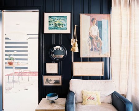
I know I have posted on black walls before. Aaaand let's do it again shall we? Designer Colleen Locke has got it so right here. Please pay attention to the black and white stripe wall, Indian rug and Saarinen table in the background. It's so good. This look can seriously be accomplished with a minimal amount of money and a maximum amount of balls. Yep. I said it. It takes balls to paint your walls black. But I believe in you. Does anyone out there have any stories or pictures of black walls they would like to share with the class?

Colleen Locke


Colleen Locke

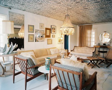
Trying to convince a client that she needs a black and white paisley wallpaper on her ceiling. I'll let you know what becomes of it.
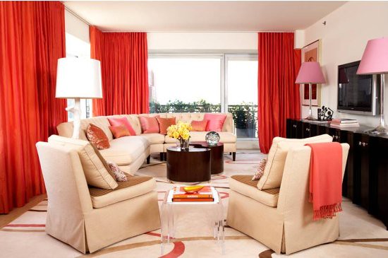
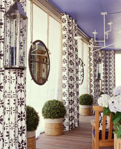
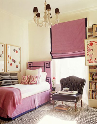
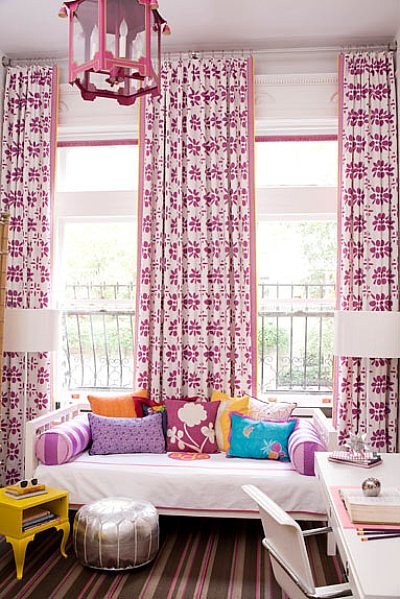
images via Lonny

Tuesday, January 11, 2011

Amanda Nisbet

Amanda Nisbet

My friend Claire is redoing a couple of rooms in her house and she is not afraid of color! In the midst of giving her my opinion, I ran across designer Amanda Nisbet who also fully embraces the color wheel. I could probably be pushed a little when it comes to bold color on the walls but I'll start with a bold color on the ceiling. Hello lavender porch! I think I've mentioned before that I have a former client who trusted me enough to paint the ceiling of her home office a bright shade of pink. It was fun, unexpected and just enough pop of color to brighten the space without overpowering it. Viva la couleur.


Amanda Nisbet


Amanda Nisbet


Amanda Nisbet


Amanda Nisbet


Amanda Nisbet


Amanda Nisbet

Thursday, December 16, 2010

A Tobi Fairley Christmas

Tobi Fairley Christmas

A green, orange and yellow Christmas color palate! Who woulda thunk it. Apparently Tobi Fairley.


Tobi Fairley Christmas

Designer, Tobi Fairley tucks real citrus (amongst the faux) into her tree and garlands closer to Christmas so that the smell permeates her home. She uses upholstery tacks to decorate the faux oranges and cloves in the real ones. Genius!

Tobi Fairley Christmas

Tobi Fairley Christmas

Tobi Fairley Christmas

Loving the modern citrus color scheme and the faux bois wrapping paper. I may be borrowing this for future Strodl decorating.


Thursday, December 9, 2010

Pantone's Color of the Year for 2011

Pantone's 2011 Color of the Year

Just in case you haven't heard- Pantone has announced that it's color of 2011 is "Honeysuckle." Love it or hate it, pink will make it's mark on fashion first and then bleed over into home goods. I normally love pink but I think this particular shade is a little "meh." What do you guys think?

Wednesday, April 7, 2010

Southwest Stylings

Southwest Concept
Art by Bern Hill, Dress by Hermes, Sandal by Ana Sui, Plate by Urban Outfitters

Ready or not- here it comes! Every time you think you have seen the end of a horrible moment in decorating (ie. coyotes, peach and turquoise color schemes, dream catchers and adobe pots that are 6 feet tall) it gets reinvented and beckons a second glance. Southwest themes are making a showing in fashion which means we're right around the corner from seeing the same in home decor. Turquoise is already here in a big way and Santa Fe motifs are popping up everywhere. I would normally deem this look as wretched but guess what? I like what I see here and I bet you do too. Admit it. You do.

You know you do.

Southwest Concept 2
Rug by Urban Outfitters, Photography by Hilary Walsh, image via Elle


Southwest Concept 3
Dress by Mod Cloth, Art by Kathy Mortonston, Chandelier by Marjorie Skouras, Fabric by Ralph Lauren Home for Kravet

Thursday, March 11, 2010

Installation Photos of Abigail's Nursery

Abigail's Nursery
Well, I finally took some photos of the nursery I was working on. Baby Abigail can arrive in style now! My client and friend is a blast to work with- really a Designer's dream because she actually defers to my suggestions. Imagine! Anyhow, definitely the vision we were going for. We couldn't paint the walls so the decal was perfect. We opted for lots of saturated color in the bedding and accessories to contrast with those cream walls and beige carpet. We sprinkled in some glamor puss and added some garden motifs for a look that is fun and vibrant.

Abigail 3

Abigail 4

Abigail 5

Abigail 2

Abigail

Abigail's Nursery


all images via Varnish Design

Tuesday, January 12, 2010

Turquoise and Tomato Red


I thought it would be fun to pair up some of these colors for 2010 and see what combinations really worked together. First off is THE color (according to Pantone anyhow) turquoise paired with tomato red. I think it's fun, happy and sophisticated. A spin on an iconic American color scheme!


images via Liz Ham, Alexandra Rowley, Plum Pretty Sugar, Mitchell Gold-Bob Williams, unknown & Anthropologie
Related Posts Plugin for WordPress, Blogger...