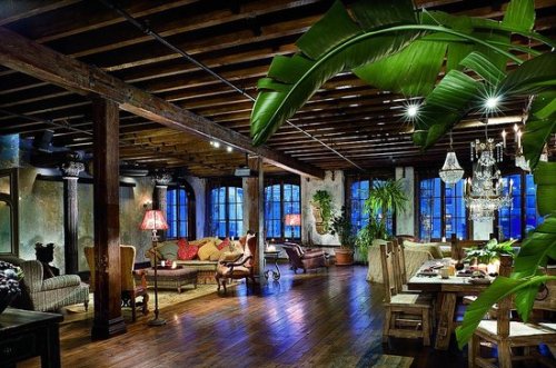
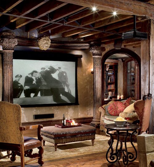
Let's just be plain. Gerard Butler is crazy good looking. I know I've seen him in movies but I am too distracted to pay attention to plot or story line or anything silly like that when he's starring. I think he may be even be in some pretty bad movies but I don't care. The funny thing is, I think I feel the exact same way about his Manhattan loft. Not that great but he's sleeping there so how bad can it be? Anyhow, I've decided the architecture is beautiful (I'm a sucker for a lot of wood) but paired with all of that heavy furniture it just makes me feel hot and not in a good way. The kitchen has its moments (love the cabinets and chandy) but it all just seems too much. Is that faux painting in there? Gah! He is in NYC for goodness sake not a chateau. So, Gerard I will work for you for free if you'd like a little editing done. I swear not to stare too much.


I meant that I DO like the hats and the chandeliers, not sure that came out right the first time.
ReplyDeleteYikes. You need to get over there pronto! Hey, I would be happy to volunteer to carry everything and bring you (and him) lunch or whatever. Ha. The bones are great but I hate almost everything else - like the hats hanging on the wall and the chandeliers. He is just so pretty.
ReplyDeletethere are things i like and then things i don't.. but in all.. i truly don't mind it that much..
ReplyDeleteand eh! considering who the owner is... i'll take it.. lol
You're so funny - yup, he's pretty easy on the eyes! I totally agree with you on his loft - just too much going on and the nice aspects are totally overshadowed by the excess! My brain is going wild with all kinds of ideas on how to edit that place down! : )
ReplyDeleteHot Man, hot Loft! ❤
ReplyDeleteStyle, matching interieur, etc... we do not need this with a Hunk like that living there... ;)
Oh, I'm with you. It's a great space, but it just doesn't quite work. Too dark.
ReplyDeleteIt's ok.
ReplyDeleteWhat can you expect from a straight man? And oh am I glad he is.
btw, I agree.
The space could work if it was done with completely modern furnishings. This does not look like the home of a 30something single man. I'll help carry as well.
ReplyDeleteHe is very good looking and the space is not that bad but I agree its little too dark:)
ReplyDeleteHave a wonderful weekend and enjoy it!
Kisses
Who would be looking at the space with him in the room? xo
ReplyDeleteman i dont think he's attractive at all! in fact I think he seems like a jerk too..! I guess Im weird.. ha I do agree on the house though
ReplyDeleteThat kitchen is to rustic for me, but I love Gerald!
ReplyDelete:) Marcie
Huh? I'm sorry I can't get past the pic of him. Damn he's hot.
ReplyDeleteI see your point, it is heavy looking, but it's also manly. It's a man-loft. And it's not someplace where I'd picture him. I would have thought more rugged.
ReplyDeleteForgive me, but I have no idea who Gerard Butler is, which doesn't really mean much because I'm not current with the celebrity scene. I do, however, love the loft...or should I say I love the floor, ceiling and gorgeous windows with the soft, glowy blue of early eve (:
ReplyDeleteAt first blush the wide shot has a cozy feel, but when you start looking at the details it gets a little tricky. But if this is comfy for him, then I guess that's really all that matters, huh?
By the way... congrats on the little one!! Hurl away my dear and look forward to the day when that part is over (:
It's definitely not something you would expect in NYC.
ReplyDeleteOk. I'm laughing. I'm sorry, but this space reminds me of my favorite Mexican restaurant. Well, not just reminds me. It pretty much looks exactly like it, just without all the tables.
ReplyDeleteInteresting space! I like how open it is and the chandelier in the kitchen. Overall, it does look pretty manly.
ReplyDeleteI love the heading!
ReplyDeleteHe is super hot!
But, he isn't a very good actor to me. :(
LOVE!
I would kill for all that space!
ReplyDeleteAD is not what it once was, in my never to be humble opinion.
ReplyDeleteThat kitchen cabinetry is fabulous!
ReplyDeleteKelly
I think he is cute too, but I fell asleep 4 times before I could finish watching Bounty Hunter... what an awful movie.
ReplyDeleteI have to say that the room where the screen is for watching movies... those chairs and sofas look sooooo incredibly uncomfortable!
I agree...what a missed opportunity.
ReplyDeletelink him when you talk about him so his PR person will find you and hire you:) Blogging has taught me that famous people do some major search engining on themselves
Holy crap! I'm sorry, but those are the actual words that came out of my mouth when I saw that top picture. Amazing, oh wow, this is exactly my style, love this, Amy!
ReplyDeleteI'll agree with you...there is a lot of good...but not necessarily how it is all put together. The pic of him...ahhhh!
ReplyDeleteSPARTANS!!
ReplyDeleteoh I sooooo agree with you! I was very "ugh" when I saw that spread in AD. So heavy and stuffy! Somebody get this guy some clean lines and simplicity!!!
ReplyDelete